This is a write-up of my first end-to-end Power BI project — from raw data in SQL Server to a published dashboard. I'm a junior analyst still learning, and I'm documenting this honestly, including what I found difficult and what I'd do differently.
What This Project Is
The project tracks the health of three indoor plants using sensor data — temperature, humidity, and soil moisture — that was already being collected and stored using Python and Airflow in a SQL Server database. My job was the analysis and reporting layer: take that raw data, model it properly, and build a Power BI dashboard that makes the plant health status immediately visible.
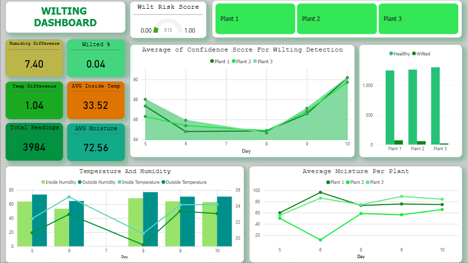
The key output on the dashboard is a Wilt Risk Score — a number between 0 and 1. Currently sitting at 0.13, which means low risk. All three plants are healthy.
The Data Model — Flat Table
The first thing I had to figure out was how to structure the data in SQL Server so that Power BI could work with it cleanly. While researching data modeling techniques, I learned about star schemas — a design that uses a central fact table connected to several dimension tables. However, since my dataset is relatively small and comes from a single source, I decided to keep the structure simple and use a flat table where all the sensor data is stored in one table.
Working with one flat table and Power BI relationships were a mess. The SQL direct query in Power BI made everything clear — relationships were straightforward and my DAX measures started making more sense.
The SQL — Loading the Flat Table
The raw sensor data came in with duplicates sometimes (retry logic from the hardware side), so I needed an upsert pattern — insert new rows, but skip if the same plant_id + timestamp already exists.
This was the first time I'd used a MERGE statement. I had to look it up and test it a few times before it worked correctly — but it's now one of my go-to patterns for loading data.
The DAX — Wilt Risk Score Measure
In Power BI, the main KPI card on the dashboard shows the Wilt Risk Score. This is a DAX measure that averages the wilt_confidence column across the filtered context (date range, plant selection, etc.).
Simple, but it took me a while to understand why it works this way — specifically, why AVERAGEX with a column reference is different from just using AVERAGE. The iterator functions in DAX were confusing at first. I'm still building intuition for when to use each one.
Other measures I wrote for this dashboard:
Dashboard Layout & Design Decisions
The dashboard has four KPI cards at the top (Wilt Risk Score, Wilted %, AVG Moisture, AVG Temp), a line chart showing moisture and confidence score trends over time, and a table showing the latest reading per plant.
I added slicers for plant selection and date range so the report is actually interactive — you can filter down to a single plant or a specific day. This was one of the more satisfying parts to build because it made the data feel usable rather than just decorative.
One thing I learned: the order of visuals on the canvas matters a lot. I initially crammed everything in without thinking about reading order, and it looked cluttered. I rebuilt the layout starting from the most important metric (Wilt Risk Score) and working outward from there.
What the Data Shows
- Day 6 anomaly: Plant 2's soil moisture dropped to ~18% — the lowest in the dataset. This was likely a missed watering. The wilt confidence score for all three plants dipped around the same time.
- Recovery by Day 10: Moisture stabilized and confidence scores recovered to ~90% across all plants.
- Overall: 3,984 readings, Wilt Risk Score of 0.13, only 0.04% of readings classified as wilting events. All three plants are currently healthy.
What I'd Do Differently
Build the date dimension table first. I added it halfway through and had to redo several relationships. It's easier to start with a proper calendar table before building any measures that rely on dates.
Name measures consistently from the start. My first version had measures named things like "measure1" and "avg test". Renaming them later while maintaining report visuals was annoying.
Use a color theme file. I spent too long manually picking colors. Power BI supports JSON theme files — I'll use that on the next project so the palette stays consistent.
What's Next
- Add time intelligence measures (month-over-month, rolling 7-day average)
- Build a second page with plant-level drill-through
- Learn Power Query M so I can transform data inside Power BI itself
- Work toward the PL-300 certification
Want To See the Source Code?
Click the "gi" button below to see the codes and technologies I used.