A step-by-step journey through data cleaning, star schema design, SQL Server, and Power BI. This is Part 1 of a four-phase sales analytics series — covering descriptive analysis: what happened?
Introduction
As a data analyst, one of the most common challenges is turning a messy raw dataset into a clear, actionable dashboard that business stakeholders can actually use. In this project, I built a complete end-to-end sales analytics pipeline — from a raw 9,994-row CSV file all the way to an interactive Power BI dashboard — using Python, SQL Server, and Power BI.
This is the first of four analysis phases:
- Descriptive Analysis ← (this post)
- Diagnostic Analysis
- Predictive Analysis
- Prescriptive Analysis
The Business Problem
The goal of descriptive analysis is to answer the fundamental question: what happened? Specifically, the business wanted to understand which products generate the most revenue, how sales performed across different regions and categories, what monthly revenue trends look like over time, and what the overall KPIs are — total revenue, profit, orders, and units sold.
The dataset used is a retail sales dataset spanning 2011 to 2014, containing over 9,900 transaction records across the United States.
The Dataset
The raw CSV contained 20 columns covering the full sales lifecycle:
Step 1: Data Cleaning with Python
The first challenge was understanding the data properly. An initial cleaning attempt reduced the dataset from 9,994 rows to just 2,650 — a red flag that something had gone wrong.
The culprit? A common mistake:
One order can contain multiple products. Deduplicating by Order ID alone deletes all but one line item per order — losing thousands of valid transactions. The correct approach removes only truly identical rows:
The final cleaning script:
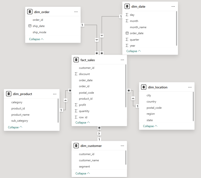
Step 2: Star Schema Design
Rather than dumping the flat CSV directly into Power BI (a common shortcut), I designed a proper star schema in SQL Server. This is industry-standard data modeling that makes dashboards faster, cleaner, and easier to maintain.
A star schema has two types of tables: a fact table that stores measurable numbers (Sales, Profit, Quantity, Discount), and dimension tables that store descriptive context (Who, What, Where, When). The fact_sales table sits at the center, connected to 5 dimension tables via foreign keys. Every metric lives in the fact table. Every label lives in a dimension.
DECIMAL(10,2) for financial columns — never FLOAT. Float has rounding errors that corrupt money calculations.
Step 3: Loading Data with Python + pyodbc
With the schema in place, I wrote a Python script to extract each dimension table from the cleaned CSV and load them into SQL Server in the correct order — dimensions first, fact table last.
Challenges encountered and fixed:
| Error | Cause | Fix |
|---|---|---|
| DateTime overflow | Pandas Timestamp not accepted by SQL Server | Convert to string "%Y-%m-%d" first |
| String truncation | Product names exceeded VARCHAR(100) | Increased to VARCHAR(255) |
| Wrong row count | dayfirst=True broke date parsing | Used format="%Y-%m-%d" explicitly |
Final verification after loading:
Step 4: Descriptive Analysis SQL Queries
Before touching Power BI, I wrote the analytical queries that would power the dashboard visuals:
Step 5: Power BI Dashboard
With the data warehouse and queries ready, I connected Power BI Desktop to SQL Server and built the dashboard. Power BI auto-detected most relationships — all 5 foreign key relationships were set to One-to-Many from dimension to fact table.
The DAX measure for Profit Margin:
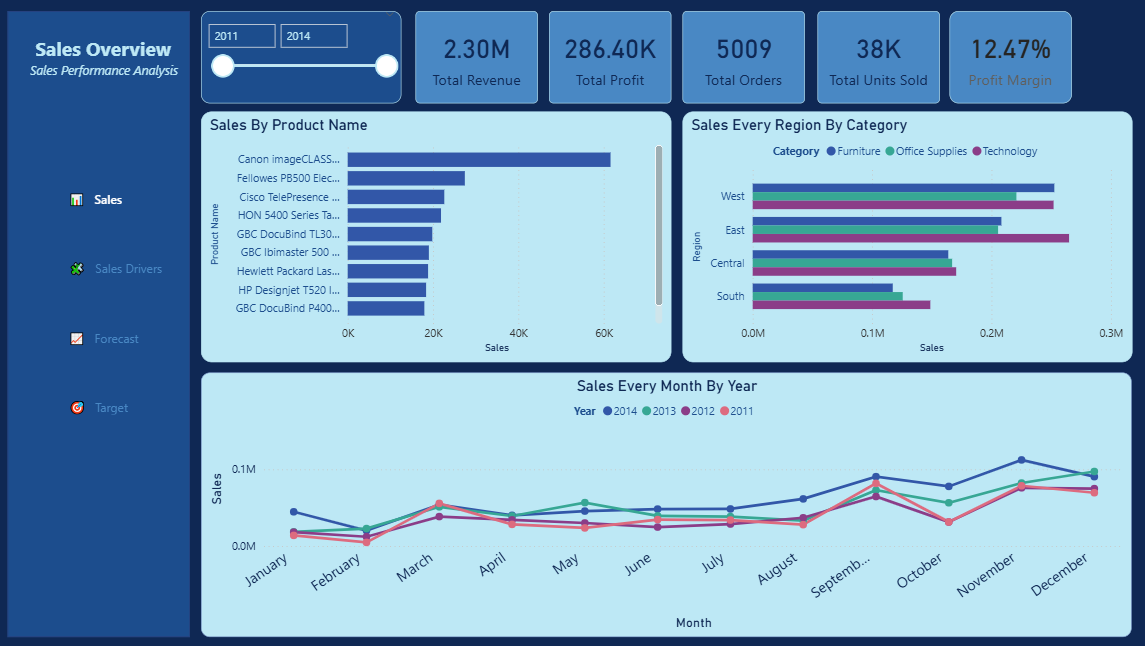
Formatted as Percentage in Measure tools — gives a clean 12.47% display. Dashboard visuals built:
| Visual | Type | Purpose |
|---|---|---|
| KPI Cards | New Card | Total Revenue, Profit, Orders, Units Sold, Profit Margin |
| Top 10 Products | Clustered Bar Chart | Identify best performing products |
| Sales by Region & Category | Clustered Bar Chart | Compare regional performance |
| Monthly Revenue Trends | Line Chart | Identify seasonal patterns |
A year range slicer was added to allow stakeholders to filter by year interactively.
Key Business Insights
Overall Performance (2011–2014):
- Total Revenue: $2.30M
- Total Profit: $286.40K
- Profit Margin: 12.47%
- Total Orders: 5,009
- Total Units Sold: 38K
- Regional Performance: West leads with the highest revenue, followed by East. South is the weakest performing region across all categories.
- Seasonal Pattern: Sales consistently spike in Q4 (November–December) every year — classic holiday/year-end demand pattern. Q1 is consistently the weakest period.
- Category Breakdown: Technology and Office Supplies are the dominant revenue drivers across all regions.
What Made This Project Different
Most Superstore dataset projects on Kaggle follow a simple path: download CSV → load to Power BI → make charts. This project took a different approach:
- Built a proper data pipeline instead of loading raw CSV directly
- Designed a star schema following data warehouse best practices
- Used SQL Server as a proper data store, not just Power BI's in-memory model
- Followed a structured analytical framework (Descriptive → Diagnostic → Predictive → Prescriptive)
- Backed every visual with SQL queries for transparency and reproducibility
What's Next
In the next phase — Diagnostic Analysis — I investigate the why behind these numbers:
- Why does West consistently outperform South?
- Why is Furniture the weakest category nationally?
- Which products are losing the company money?
- What is the relationship between discounting and profit margin?
Want To See the Source Code?
Click the "gi" button below to see the codes and technologies I used.