Phase 2 of a four-part sales analytics series. Having established what happened in the descriptive analysis, this phase investigates why — digging into discount patterns, loss-making products, regional differences, and seasonal demand.
Introduction
Diagnostic analysis answers the question: why did it happen? The descriptive dashboard told us West leads in revenue, Central underperforms, and Canon is the top product. This phase investigates the root causes behind those patterns using SQL queries, Power BI visuals, and DAX measures.
This is Part 2 of four phases: Descriptive Analysis, Diagnostic Analysis (this post), Predictive Analysis, and Prescriptive Analysis.
The Business Questions
Going into this phase, four questions drove the investigation: why does East lead in Technology sales, why is South the weakest region, why is Canon imageCLASS the top seller by such a large margin, and what is causing Central region's low profit margin despite decent revenue?
Investigation 1: Why is Canon the Top Seller?
Rather than assuming, I wrote a SQL query to find exactly who buys Canon, where, and at what margin:
SELECT l.region, c.segment,
  SUM(f.sales)    AS total_revenue,
  SUM(f.quantity) AS total_quantity,
  AVG(f.discount) AS avg_discount,
  SUM(f.profit)   AS total_profit
FROM fact_sales f
JOIN dim_product  p ON f.product_id  = p.product_id
JOIN dim_location l ON f.postal_code = l.postal_code
JOIN dim_customer c ON f.customer_id = c.customer_id
WHERE p.product_name LIKE '%Canon imageCLASS%'
GROUP BY l.region, c.segment
ORDER BY total_revenue DESC;
The results revealed that Central Corporate leads Canon purchases at $20,299 revenue with a healthy 45% margin. But East Corporate showed a critical problem — only $839 revenue at a 40% discount, nearly zeroing out the profit margin.
Investigation 2: Why is South the Weakest Region?
To diagnose South, I looked at what South actually buys most — by units, not revenue:
SELECT TOP 10 p.product_name, p.category,
  SUM(f.sales)    AS total_revenue,
  SUM(f.quantity) AS total_units
FROM fact_sales f
JOIN dim_product  p ON f.product_id  = p.product_id
JOIN dim_location l ON f.postal_code = l.postal_code
WHERE l.region = 'South'
GROUP BY p.product_name, p.category
ORDER BY total_units DESC;
The results showed South's top 10 products are almost entirely cheap Office Supplies — Staples, Paper, Binders, Fasteners. Zero Technology in the top 10. Canon is a high-end printer. South customers aren't Technology buyers — they're consumables buyers.
Investigation 3: The Discount Problem
After spotting discount issues in individual products, I investigated discount patterns across all regions:
SELECT l.region,
  AVG(f.discount)               AS avg_discount,
  SUM(f.sales)                  AS total_revenue,
  SUM(f.profit)                 AS total_profit
FROM fact_sales f
JOIN dim_location l ON f.postal_code = l.postal_code
GROUP BY l.region
ORDER BY avg_discount DESC;
Results showed a clear pattern — Central discounts at 24% average and has only 7.92% profit margin. West discounts at 10.9% and has 14.94% margin. The inverse relationship is unmistakable.
Investigation 4: Loss-Making Products
To surface products that are actively losing money, I created a DAX measure that only shows negative profit values:
          Loss Products =
            IF(SUM(fact_sales[profit]) < 0,
            SUM(fact_sales[profit]),
            BLANK())
The biggest offender: Cubify CubeX 3D Printer in East region — $6,299 revenue but -$9,239 profit due to a 70% discount. Someone authorized a 70% discount on a 3D printer and the company lost more than the product's revenue.
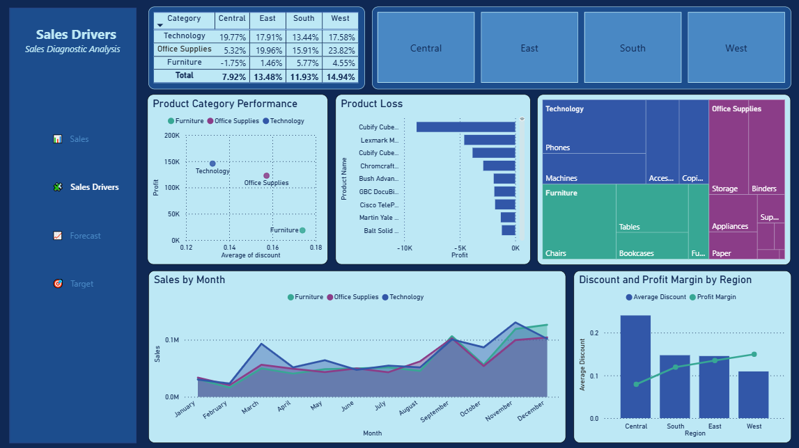
Dashboard — Sales Drivers Page
The diagnostic page was built with 6 visuals, each answering a specific business question:
| Type | Question Answered | Line & Column Chart | Does higher discount = lower margin? | Matrix | Which region+category is losing money? | Bar Chart | Which products have negative profit? | Scatter Plot | What is the overall discount-profit relationship? | Line Chart | What are the seasonal demand patterns? | Treemap | Which sub-categories drive the most revenue? |
|---|
A region slicer was added as button-style cards at the top — allowing stakeholders to filter the entire page by region interactively.
Key Diagnostic Insights
- Central is over-discounting Furniture — -1.75% profit margin, the only negative margin in the entire dataset
- Cubify CubeX is the biggest loss product — 70% discount causing -$9,239 loss in East region
- West is the best practice region — lowest discount at 10.9%, highest margin at 14.94%
- South needs a cross-sell strategy — not a revenue problem, it's a product mix problem
- Q4 is peak season for all categories — Technology most volatile, Office Supplies most stable
- Technology dominates revenue — Phones and Machines are the two largest treemap boxes
What Made This Analysis Different
Most Kaggle analyses stop at "West has the highest sales." This diagnostic phase went deeper — it found the specific products losing money, the exact discount percentages killing margin, and a cross-selling opportunity in South that the descriptive analysis alone would never surface. Every finding is backed by a SQL query, not just a visual observation.
What's Next
Phase 3 is Predictive Analysis — using Python machine learning to forecast future sales trends and predict which products are at risk of declining demand. The diagnostic findings will inform the features used in the model.
Want To See the Source Code?
Click the "gi" button below to view all SQL queries and DAX measures on GitHub.